Websites
Above-the-fold best practices
Make the first screen do its job. One promise, one proof, one clear action, fast, readable, and built for mobile.

The first screen has one job
Above the fold is the first screen a visitor sees without scrolling. It must say what you do, why you are worth a click, and where to click next. Keep it clean. Keep it fast. If the first screen is clear, people stay. If it is noisy or vague, they leave.
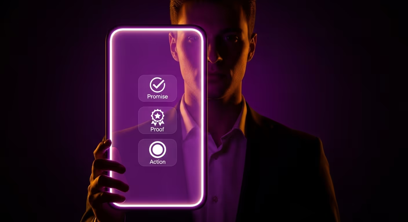
The three-part rule
- Promise: One line that states the outcome you deliver.
- Proof: One short stat, logo row, or quote near the promise.
- Action: One primary button that starts the path.
That is the core. Do not add extra buttons or long text here. Save detail for lower sections.
Write a promise that earns attention
State the result in simple words. Name the audience when it helps. Cut buzzwords. Your line should fit on two short lines on a phone.
- Good: “Websites and content that grow your business.”
- Good: “Local SEO and daily social for busy owners.”
- Weak: “Innovative digital solutions for modern brands.”
Add a one-sentence subhead if needed. It can set scope, like “Monthly plans that include site, blog, and social.” Keep it under 18 words.
Place proof next to the claim
Proof reassures the wary reader. Keep it tight and specific.
- “50k+ monthly search impressions by month six”
- “100k+ monthly impressions after one year”
- Logo row of two or three clients
- A short quote with a name, like “Daily table requests since launch.”
Do not bury proof below the fold. Place it near the promise so the eye sees both at once.
Use one action and make it obvious
Pick a single action for the fold. Examples: “See pricing,” “Start your plan,” or “Book a call.” Use a solid button, full width on mobile, with clear text. No vague labels. No ghost buttons here.
Mobile first layout
Most visitors land on a phone. Design the fold for small screens first, then scale up.
- Keep the promise at 2–3 short lines.
- Keep the subhead to one line if you can.
- Show a small proof line or two small logos under the subhead.
- Place one bold button under the proof with good spacing.
- Keep all of this visible without scrolling on common phone sizes.
Desktop layout without clutter
On larger screens you have room, but do not fill it with noise.
- Keep the same promise, proof, and action.
- Use one supporting visual: a person, product, or abstract brand image.
- Avoid complex UI mockups with tiny text that no one can read.
- Keep contrast strong so the button stands out.
Speed matters
The fold must load fast. People bounce when the hero drags.
- Compress hero images and use modern formats.
- Lazy load anything below the fold.
- Cut heavy scripts and third-party widgets from the hero.
- Keep font files light. Two weights are often enough.
Type and spacing that read well
Great copy fails when it is hard to read. Simple type rules fix that.
- Use a large, clean headline size on mobile and scale up on desktop.
- Keep line length short. Around 6–10 words per line on phones works well.
- Use generous line height so lines do not crowd.
- Leave space around the main button so it is easy to tap.
What to show as the visual
Pick one visual that supports the promise. Do not let it steal focus from the button.
- People: A real or stylized person facing the camera can build trust.
- Product: A clean photo or a simple abstract that suggests function.
- Abstract brand art: Shapes and light that match your palette and mood.
Avoid busy screenshots with small labels. If you must show UI, crop tight and keep labels large.
Copy patterns that work
Here are simple patterns you can adapt:
- Outcome + audience: “SEO and content for local clinics.”
- Outcome + time: “From zero to steady search traffic in six months.”
- Outcome + method: “Websites built to rank and convert.”
Pair the pattern with a short proof line and the primary button.
Make the button text action-led
Button text should say what happens next. Keep it to two or three words.
- See pricing
- Start your plan
- Book a call
- Get a quote
Skip vague labels like “Learn more.” Save those for lower sections.
Accessibility basics for the fold
Small changes help more people use your site and help rankings as well.
- Strong color contrast for text and buttons.
- Clear focus states for keyboard users.
- Alt text for the hero image that names the subject.
- Logical heading order. Do not skip levels.
AEO in the fold
People ask direct questions in search. Align the fold with that habit.
- Use a subhead that mirrors a common question and gives a short answer.
- Add a tiny FAQ link under the button that jumps to an on-page FAQ.
- Keep the answer short and literal. No filler.
What not to include above the fold
- Auto-playing video with sound.
- Carousels that hide key content on the second slide.
- Two or three competing buttons.
- Dense paragraphs that push the button below the fold.
- Huge logo rows that bury the promise.
Header choices that help the fold
The header can help or hurt the fold. Keep it light.
- Five or fewer top-level links.
- One clear header button that matches the fold action.
- Sticky header only if it does not cover the hero on small screens.
Measure what matters
Track simple numbers that map to the fold’s job.
- Hero button click-through rate: Shares how many visitors start the path.
- Scroll depth: Shows how many people go past the fold.
- Time to interactive: Tells you if speed blocks action.
- Mobile vs desktop: Confirms if the fold holds up on phones.
Small tests with big impact
Change one thing at a time so results are clear.
- Promise line variant A vs B.
- Proof style: stat vs short quote.
- Button text: “See pricing” vs “Start your plan.”
- Visual: person vs abstract art.
Let each test run long enough to reach steady data. Use the winning version as your new base.
Examples of clean folds
These simple layouts work across many niches:
- Service brand: Promise line, proof stat, one button, a person image.
- SaaS: Promise line, three logos, one button, a cropped product shot.
- Local business: Promise line, quote with name, one button, a real photo of the team.
Speed checklist for the hero
- Hero image under 200–300 KB when possible.
- Preload the hero font if it is large.
- Inline critical CSS for the hero.
- Defer non-critical scripts.
Keep the fold honest
Do not promise what the rest of the page cannot back up. The fold should match the value and tone below. If your fold claims fast growth, show a chart later. If your fold pushes a plan, show the plan steps below.
A template you can copy
[Hero container]H1: One-line promise with the outcomeSubhead: One line that sets scopeProof: One stat or a short quote (or two small logos)[Primary button: action-led text][Support visual: person, product, or abstract art]Notes:- Keep all of this above the fold on mobile- Strong contrast, large type, generous spacing- One action only
Final notes
Above the fold is not a place for everything. It is a place for the point. State the promise, show a reason to believe, and give one next step. Keep it fast and readable. If you do this well, the rest of the page gets a fair chance to do its work.
read more
Similar articles

Webflow and Make Formalize Partnership to Automate Website Workflows

How to Choose a Webflow Template for Your Business in 2026
Let’s grow
Start your monthly marketing system today
No guesswork, no back-and-forth. Just one team managing your website, content, and social. Built to bring in traffic and results.


